음주데이터분석
in Study on datavisualization
전세계 음주 데이터 분석하기
# -*- coding: utf-8 -*-

import pandas as pd
import numpy as np
import matplotlib.pyplot as plt

file_path = 'data/drinks.csv'
drinks = pd.read_csv(file_path) # read_csv 함수로 데이터를 Dataframe 형태로 불러오기
print(drinks.info())
<class 'pandas.core.frame.DataFrame'>
RangeIndex: 193 entries, 0 to 192
Data columns (total 6 columns):
 #   Column                        Non-Null Count  Dtype
---  ------                        --------------  -----
 0   country                       193 non-null    object
 1   beer_servings                 193 non-null    int64
 2   spirit_servings               193 non-null    int64
 3   wine_servings                 193 non-null    int64
 4   total_litres_of_pure_alcohol  193 non-null    float64
 5   continent                     170 non-null    object
dtypes: float64(1), int64(3), object(2)
memory usage: 9.2+ KB
None
drinks.head(10)
| country | beer_servings | spirit_servings | wine_servings | total_litres_of_pure_alcohol | continent | |
|---|---|---|---|---|---|---|
| 0 | Afghanistan | 0 | 0 | 0 | 0.0 | AS |
| 1 | Albania | 89 | 132 | 54 | 4.9 | EU |
| 2 | Algeria | 25 | 0 | 14 | 0.7 | AF |
| 3 | Andorra | 245 | 138 | 312 | 12.4 | EU |
| 4 | Angola | 217 | 57 | 45 | 5.9 | AF |
| 5 | Antigua & Barbuda | 102 | 128 | 45 | 4.9 | NaN |
| 6 | Argentina | 193 | 25 | 221 | 8.3 | SA |
| 7 | Armenia | 21 | 179 | 11 | 3.8 | EU |
| 8 | Australia | 261 | 72 | 212 | 10.4 | OC |
| 9 | Austria | 279 | 75 | 191 | 9.7 | EU |
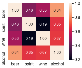
[피처간의 상관관계 탐색]
단순 상관 분석
두 변수간의 선형적인 관계를 상관계수로 표현하는 것 얼마나 연관이 있는가 확인
# 'beer_servings', 'wine_servings' 두 피처간의 상관계수를 계산(소비량)
# pearson은 상관계수를 구하는 계산 방법 중 하나를 의미하며, 가장 널리 쓰이는 방법
corr = drinks[['beer_servings', 'wine_servings']].corr(method = 'pearson')
#피어슨 상관계수
# 1이높고 0이 낮다
print(corr)
               beer_servings  wine_servings
beer_servings       1.000000       0.527172
wine_servings       0.527172       1.000000
# 피처간의 상관계수 행렬을 구하기
cols = ['beer_servings', 'spirit_servings', 'wine_servings', 'total_litres_of_pure_alcohol']
corr = drinks[cols].corr(method = 'pearson')
print(corr)
                              beer_servings  spirit_servings  wine_servings  \
beer_servings                      1.000000         0.458819       0.527172
spirit_servings                    0.458819         1.000000       0.194797
wine_servings                      0.527172         0.194797       1.000000
total_litres_of_pure_alcohol       0.835839         0.654968       0.667598

                              total_litres_of_pure_alcohol
beer_servings                                     0.835839
spirit_servings                                   0.654968
wine_servings                                     0.667598
total_litres_of_pure_alcohol                      1.000000
# seaborn으로 시각화
import seaborn as sns

# corr 행렬 히트맵을 시각화
cols_view = ['beer', 'spirit', 'wine', 'alcohol'] # 그래프 출력을 위한 cols 이름을 축약
sns.set(font_scale=1.5)
hm = sns.heatmap(corr.values,
            cbar=True,
            annot=True,
            square=True,
            fmt='.2f',
            annot_kws={'size': 15},
            yticklabels=cols_view,
                #cols_view레이블
            xticklabels=cols_view)
                # cols_view레이블
plt.tight_layout()
plt.show()
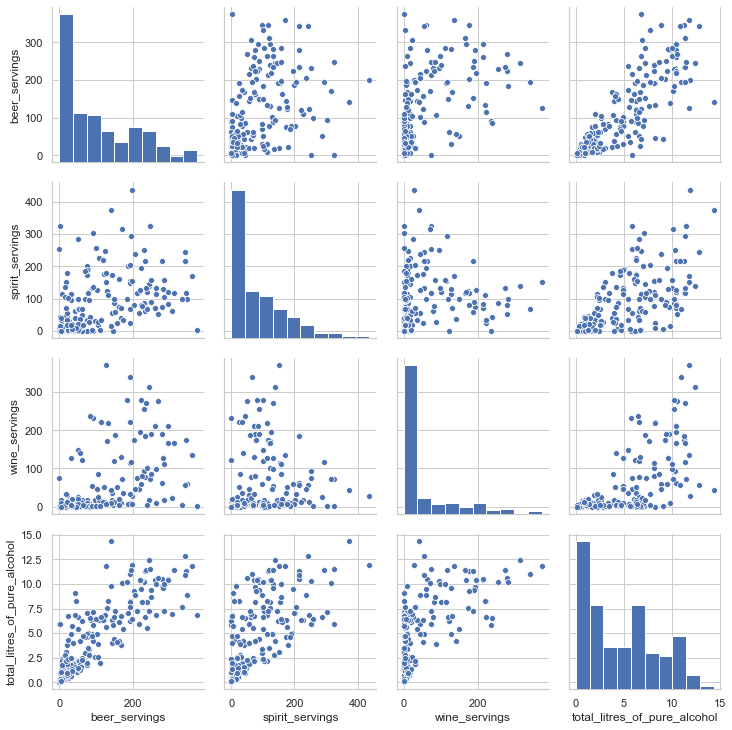
# 시각화 라이브러리를 이용한 피처간의 scatter plot을 출력
sns.set(style='whitegrid', context='notebook')
sns.pairplot(drinks[['beer_servings', 'spirit_servings',
                     'wine_servings', 'total_litres_of_pure_alcohol']], height=2.5)
plt.show()
결측치 처리
print(drinks.isnull().sum())
print("------------------------------------")
print(drinks.dtypes)
country                          0
beer_servings                    0
spirit_servings                  0
wine_servings                    0
total_litres_of_pure_alcohol     0
continent                       23
dtype: int64
------------------------------------
country                          object
beer_servings                     int64
spirit_servings                   int64
wine_servings                     int64
total_litres_of_pure_alcohol    float64
continent                        object
dtype: object
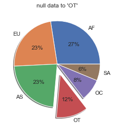
# 결측데이터를 처리 : 기타 대륙으로 통합 -> 'OT'
drinks['continent'] = drinks['continent'].fillna('OT')
print(drinks.isnull().sum())
country                         0
beer_servings                   0
spirit_servings                 0
wine_servings                   0
total_litres_of_pure_alcohol    0
continent                       0
dtype: int64
drinks.head(10)
| country | beer_servings | spirit_servings | wine_servings | total_litres_of_pure_alcohol | continent | |
|---|---|---|---|---|---|---|
| 0 | Afghanistan | 0 | 0 | 0 | 0.0 | AS |
| 1 | Albania | 89 | 132 | 54 | 4.9 | EU |
| 2 | Algeria | 25 | 0 | 14 | 0.7 | AF |
| 3 | Andorra | 245 | 138 | 312 | 12.4 | EU |
| 4 | Angola | 217 | 57 | 45 | 5.9 | AF |
| 5 | Antigua & Barbuda | 102 | 128 | 45 | 4.9 | OT |
| 6 | Argentina | 193 | 25 | 221 | 8.3 | SA |
| 7 | Armenia | 21 | 179 | 11 | 3.8 | EU |
| 8 | Australia | 261 | 72 | 212 | 10.4 | OC |
| 9 | Austria | 279 | 75 | 191 | 9.7 | EU |
# 파이차트 시각화
labels = drinks['continent'].value_counts().index.tolist()
# index = as, eu등등
fracs1 = drinks['continent'].value_counts().values.tolist()
# as,eu등의 갯수
explode = (0, 0, 0, 0.25, 0, 0)

plt.pie(fracs1, explode=explode, labels=labels, autopct='%.0f%%', shadow=True)
plt.title('null data to \'OT\'')
plt.show()
apply, agg 함수를 이용한 대륙별 분석
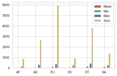
# 대륙별 spirit_servings의 평균, 최소, 최대, 합계를 계산
result = drinks.groupby('continent').spirit_servings.agg(['mean', 'min', 'max', 'sum'])

result.head()
| mean | min | max | sum | |
|---|---|---|---|---|
| continent | ||||
| AF | 16.339623 | 0 | 152 | 866 |
| AS | 60.840909 | 0 | 326 | 2677 |
| EU | 132.555556 | 0 | 373 | 5965 |
| OC | 58.437500 | 0 | 254 | 935 |
| OT | 165.739130 | 68 | 438 | 3812 |
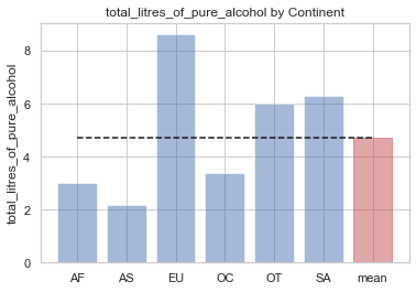
# 전체 평균보다 많은 알코올을 섭취하는 대륙을 구하기
total_mean = drinks.total_litres_of_pure_alcohol.mean()
#전체평균
continent_mean = drinks.groupby('continent')['total_litres_of_pure_alcohol'].mean()
# 대륙별 평균
continent_over_mean = continent_mean[continent_mean >= total_mean]
#대륙별 평균이 전체 평균보다 큰것만 구하기
print(continent_over_mean)
continent
EU    8.617778
OT    5.995652
SA    6.308333
Name: total_litres_of_pure_alcohol, dtype: float64
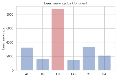
# 평균 beer_servings이 가장 높은 대륙을 구하기
beer_continent = drinks.groupby('continent').beer_servings.mean().idxmax()
#idxmax는 가장 값이 큰 인덱스를 나타낸다.
print(beer_continent)
EU
분석결과 시각화
# 대륙별 spirit_servings의 평균, 최소, 최대, 합계를 시각화합니다.
n_groups = len(result.index)
means = result['mean'].tolist()
#값을 리스트로 넣어줌
mins = result['min'].tolist()
maxs = result['max'].tolist()
sums = result['sum'].tolist()

index = np.arange(n_groups)
bar_width = 0.1


rects1 = plt.bar(index, means, bar_width,
                 color='r',
                 label='Mean')

rects2 = plt.bar(index + bar_width, mins, bar_width,
                 color='g',
                 label='Min')

rects3 = plt.bar(index + bar_width * 2, maxs, bar_width,
                 color='b',
                 label='Max')

rects3 = plt.bar(index + bar_width * 3, sums, bar_width,
                 color='y',
                 label='Sum')

plt.xticks(index, result.index.tolist())
# x값에 index 넣어주기
plt.legend()
plt.show()
# 대륙별 total_litres_of_pure_alcohol을 시각화
continents = continent_mean.index.tolist()
continents.append('mean')
x_pos = np.arange(len(continents))
alcohol = continent_mean.tolist()
alcohol.append(total_mean)

bar_list = plt.bar(x_pos, alcohol, align='center', alpha=0.5)

bar_list[len(continents) - 1].set_color('r')
# 마지막 x를 빨간색으로 바꿔주기
plt.plot([0., 6], [total_mean, total_mean], "k--")
plt.xticks(x_pos, continents)

plt.ylabel('total_litres_of_pure_alcohol')
plt.title('total_litres_of_pure_alcohol by Continent')

plt.show()
# 대륙별 beer_servings을 시각화
beer_group = drinks.groupby('continent')['beer_servings'].sum()
continents = beer_group.index.tolist()
y_pos = np.arange(len(continents))
alcohol = beer_group.tolist()

bar_list = plt.bar(y_pos, alcohol, align='center', alpha=0.5)
bar_list[continents.index("EU")].set_color('r')
plt.xticks(y_pos, continents)
plt.ylabel('beer_servings')
plt.title('beer_servings by Continent')

plt.show()
분석 대상간의 통계적 차이 검정하기
# t-test 두집단간의 평균의 차이에 대한 검정방법

# 귀무가설 : 두 집단의 평균이 같다.
# 대립가설 : 두 집단의 평균이 다르다.

# 아프리카와 유럽간의 맥주 소비량 차이를 검정

africa = drinks.loc[drinks['continent']=='AF']
europe = drinks.loc[drinks['continent']=='EU']

from scipy import stats

tTestResult = stats.ttest_ind(africa['beer_servings'], europe['beer_servings'])

tTestResultDiffVar = stats.ttest_ind(africa['beer_servings'], europe['beer_servings'], equal_var=False)
# ttest_ind 함수 > 분산이 같은지도 확인

print("The t-statistic and p-value assuming equal variances is %.3f and %.3f." % tTestResult)
print("The t-statistic and p-value not assuming equal variances is %.3f and %.3f" % tTestResultDiffVar)
# p-value가 0.05보다 작으면 더 데이터 평균이 차이가 날것이다로 확인
# 아프리카와 유럽간의 맥주 소비량 차이는 통계적으로 유의미하다.
The t-statistic and p-value assuming equal variances is -7.268 and 0.000.
The t-statistic and p-value not assuming equal variances is -7.144 and 0.000
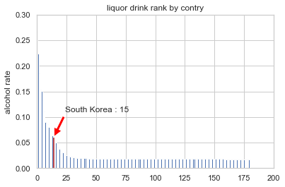
국가별 순위 정보를 그래프로 시각화
# total_servings 피처를 생성
drinks['total_servings'] = drinks['beer_servings'] + drinks['wine_servings'] + drinks['spirit_servings']

# 술 소비량 대비 알콜 비율 피처를 생성
drinks['alcohol_rate'] = drinks['total_litres_of_pure_alcohol'] / drinks['total_servings']
drinks['alcohol_rate'] = drinks['alcohol_rate'].fillna(0)

# 순위 정보를 생성
country_with_rank = drinks[['country', 'alcohol_rate']]
country_with_rank = country_with_rank.sort_values(by=['alcohol_rate'], ascending=0)
country_with_rank.head(5)
| country | alcohol_rate | |
|---|---|---|
| 63 | Gambia | 0.266667 |
| 153 | Sierra Leone | 0.223333 |
| 124 | Nigeria | 0.185714 |
| 179 | Uganda | 0.153704 |
| 142 | Rwanda | 0.151111 |
# 국가별 순위 정보를 그래프로 시각화
country_list = country_with_rank.country.tolist()
x_pos = np.arange(len(country_list))
rank = country_with_rank.alcohol_rate.tolist()

bar_list = plt.bar(x_pos, rank)
bar_list[country_list.index("South Korea")].set_color('r')
plt.ylabel('alcohol rate')
plt.title('liquor drink rank by contry')
plt.axis([0, 200, 0, 0.3])

korea_rank = country_list.index("South Korea")
korea_alc_rate = country_with_rank[country_with_rank['country'] == 'South Korea']['alcohol_rate'].values[0]
plt.annotate('South Korea : ' + str(korea_rank + 1),
             xy=(korea_rank, korea_alc_rate),
             xytext=(korea_rank + 10, korea_alc_rate + 0.05),
             arrowprops=dict(facecolor='red', shrink=0.05))

plt.show()